Terminal API custom user interface guide
This document provides a step-by-step guide for merchants who manage POS and ECR systems and use the Terminal API app, and want to display a customized screen on the terminal when certain actions are triggered. This allows information to be shown or input to be collected during defined operational flows.
The screens are fully customizable and can support a wide range of use cases tailored to customer needs. Think of them as white-label interfaces whose content you can adapt to present information in different ways.
Typical use cases include:
- Confirmations or promotional messages with a title, subtitle, description, and action buttons to capture user decisions.
- Provide a single-choice selection from a list, with optional icons and a unique ID per option (such as ratings, feedback, or receipt delivery preferences).
- Allow multiple selections from a list (checkbox-style) with icons and configurable actions.
- Show a custom image (e.g., promo or branding) with configurable button colors and standard actions.
- Display a QR code for scanning to enroll, access resources, or connect to external services.
- Present structured data in a table or formatted list for receipts, itemized details, or transaction information.
- Capture a digital signature for approvals, contracts, or delivery confirmations.
- Collecting data such as email, phone number, ZIP code, or tip amount with built-in validation.
General usage
Custom screens are displayed in response to HTTP requests from your POS, ECR, backend, or a tool such as Postman. Send a SaleToPOIDeviceRequest to the v2 device endpoint with the screen definition in DeviceRequest.InputRequest.DisplayOutput.MessageContent.
The examples below follow protocol 5.1-WL2.1.1 in the latest API reference. They display the same confirmation screen using either synchronous or asynchronous processing.
Request and interaction flow
- Send a POST request to the synchronous or asynchronous device endpoint, using your merchant (
umid) and terminal (utid) identifiers in the URL and your API key as a bearer token. - Include
HeaderandDeviceRequestinsideSaleToPOIDeviceRequest. - Set
Header.MessageFunctiontoDeviceRequest, use a UUID forHeader.ExchangeIdentification, and supplyHeader.SalesSystemInfowith your integrator and sale-software details. - Include
InputRequestinsideDeviceRequest. Choose a supported screen, such asInfoScreen, inInputRequest.DisplayOutput.MessageContent. - The terminal displays the screen and collects the user's interaction.
InputData.MaximumInputTimeis an integer in milliseconds; the examples use30000(30 seconds). - Read the result from the synchronous response or the asynchronous webhook, as described below.
Before sending either example
- Replace
YOUR_MERCHANT_ID,YOUR_TERMINAL_ID, andYOUR_TOKENwith your identifiers and API key. - Replace
YOUR_INTEGRATOR_IDwith the value provided by Worldline, and setSaleSoftware.TypeandStatus.VersionNumberto describe your software. The software version is distinct fromHeader.ProtocolVersion. - Generate a UUID for
ExchangeIdentificationfor each new request and setCreationDateTimeto the current time in ISO 8601 format. The UUIDs and timestamps shown below are examples. - For asynchronous requests, replace the example
WebhookUrlwith your publicly reachable HTTPS callback URL.
Synchronous example
/api/v2/merchants/{umid}/terminals/{utid}/device/syncThe connection stays open until the terminal responds or the request times out. WebhookUrl and NumberOfRetries are not needed for this synchronous request.
curl --location 'https://api.terminal.iacc.global.worldline-solutions.com/api/v2/merchants/YOUR_MERCHANT_ID/terminals/YOUR_TERMINAL_ID/device/sync' \
  --header 'Content-Type: application/json' \
  --header 'Authorization: Bearer YOUR_TOKEN' \
  --data '{
  "SaleToPOIDeviceRequest": {
    "Header": {
      "MessageFunction": "DeviceRequest",
      "ProtocolVersion": "5.1-WL2.1.1",
      "ExchangeIdentification": "1a2b3c4d-5e6f-4a7b-8c9d-0e1f2a3b4c5d",
      "CreationDateTime": "2026-09-25T10:00:00+02:00",
      "InitiatingParty": {
        "Identification": "YOUR_MERCHANT_ID",
        "Type": "Merchant"
      },
      "SalesSystemInfo": {
        "IntegratorId": "YOUR_INTEGRATOR_ID",
        "SaleSoftware": [
          {
            "Type": "ECR",
            "Status": {
              "VersionNumber": "1.0.0"
            }
          }
        ]
      }
    },
    "DeviceRequest": {
      "InputRequest": {
        "DisplayOutput": {
          "MessageContent": {
            "InfoScreen": {
              "Title": "Do you want to redeem your loyalty card?",
              "Subtitle": "You currently have enough points for a 2.50 EUR discount",
              "Text": "This will apply the discount to your current transaction",
              "PrimaryButton": {
                "ButtonId": "first_button",
                "ButtonContent": "Yes"
              },
              "SecondaryButton": {
                "ButtonId": "second_button",
                "ButtonContent": "No"
              },
              "ShowLogo": true,
              "BackgroundColor": "#6200EE",
              "ButtonColor": "#3700B3"
            }
          }
        },
        "InputData": {
          "MaximumInputTime": 30000
        }
      }
    }
  }
}'
Asynchronous example
/api/v2/merchants/{umid}/terminals/{utid}/deviceFor asynchronous processing, include Header.WebhookUrl and Header.NumberOfRetries. This example requests one webhook-delivery retry. New work returns 202 Accepted; an existing exchange returns 200 OK with its current state. Read transactionId, status, and requestId at the acknowledgement root. The terminal result is delivered separately as a POST to your webhook.
curl --location 'https://api.terminal.iacc.global.worldline-solutions.com/api/v2/merchants/YOUR_MERCHANT_ID/terminals/YOUR_TERMINAL_ID/device' \
  --header 'Content-Type: application/json' \
  --header 'Authorization: Bearer YOUR_TOKEN' \
  --data '{
  "SaleToPOIDeviceRequest": {
    "Header": {
      "MessageFunction": "DeviceRequest",
      "ProtocolVersion": "5.1-WL2.1.1",
      "ExchangeIdentification": "550e8400-e29b-41d4-a716-446655440000",
      "CreationDateTime": "2026-09-25T10:00:00+02:00",
      "InitiatingParty": {
        "Identification": "YOUR_MERCHANT_ID",
        "Type": "Merchant"
      },
      "SalesSystemInfo": {
        "IntegratorId": "YOUR_INTEGRATOR_ID",
        "SaleSoftware": [
          {
            "Type": "ECR",
            "Status": {
              "VersionNumber": "1.0.0"
            }
          }
        ]
      },
      "WebhookUrl": "https://example.com/terminal-api/webhook",
      "NumberOfRetries": 1
    },
    "DeviceRequest": {
      "InputRequest": {
        "DisplayOutput": {
          "MessageContent": {
            "InfoScreen": {
              "Title": "Do you want to redeem your loyalty card?",
              "Subtitle": "You currently have enough points for a 2.50 EUR discount",
              "Text": "This will apply the discount to your current transaction",
              "PrimaryButton": {
                "ButtonId": "first_button",
                "ButtonContent": "Yes"
              },
              "SecondaryButton": {
                "ButtonId": "second_button",
                "ButtonContent": "No"
              },
              "ShowLogo": true,
              "BackgroundColor": "#6200EE",
              "ButtonColor": "#3700B3"
            }
          }
        },
        "InputData": {
          "MaximumInputTime": 30000
        }
      }
    }
  }
}'
Reading the v2 response
- Synchronous
200 OK: Read the Nexo payload frombody.data, rather than directly from the response root. For a device response, this isbody.data.SaleToPOIDeviceResponse. - Synchronous
202 Accepted: The request was accepted but no terminal payload arrived before the timeout. The response contains arequestId, not the user's choice. - Asynchronous
202 Acceptedor200 OK: ReadtransactionId,status, andrequestIdat the acknowledgement root.202acknowledges new work;200reports an existing exchange. Read the eventual Nexo response from the webhook'sdatafield; the webhook envelope also includesrequestId. Return a 2xx status to acknowledge receipt and handle duplicate callbacks. See duplicate handling and status lookup. - Synchronous
409 Conflict: The exchange is already in progress or cannot be replayed. Look up its status before deciding how to recover. - HTTP errors: Read
body.messageand retainbody.requestIdfor diagnostics. The v1body.codefield is not used in v2.
For the confirmation screen above, check the device result in data.SaleToPOIDeviceResponse.DeviceResponse.Response. The user's selected ButtonId is returned at data.SaleToPOIDeviceResponse.DeviceResponse.InputResponse.InputResult.InputResultData.InputMessage: first_button for Yes or second_button for No. Do not treat an HTTP acknowledgement as a completed interaction; inspect the Nexo result or rejection before reading input data.
See the DeviceInputResponse and MessageRejectionResponse examples in the API reference for complete response payloads.
Screen scope
Showing any screen depends on the MessageContent object that the external system sends. MessageContent should contain the screen names like:
- InfoScreen: A basic information display with a title, subtitle, descriptive text, and primary/secondary action buttons. Ideal for confirmations, promotional messages, or scenarios where you need to capture a user’s decision.
- ImageInfoScreen: Shows an image with texts. Excellent for transaction status screens, with customizable button colors and standard actions.
- MultiOptionsSingleSelectionScreen: A single-choice interface with multiple options, each supporting custom icons. Great for menus or category selection, each option includes a unique ID for response handling.
- QRScreen: Displays a QR code for easy scanning. Perfect for loyalty enrollments, website links, or linking to external resources, with customizable title/subtitle and optional actions.
- InfoTableScreen: Presents structured data in a table or formatted list. Ideal for receipts, itemized bills, or transaction details, with properly aligned, readable data.
- SignatureScreen: A digital signature capture area for electronic approvals, contracts, or delivery confirmations. Includes a drawing surface and confirm/cancel options.
- ImageScreen: Shows a base64-encoded image only. Excellent for promos, product visuals, instructions, or branding, with customizable button colors and standard actions.
- MultiOptionsMultiSelectionScreen: A multiple-choice interface that allows selecting several options. Useful for surveys, preferences, or configuration tasks, with checkbox-style selection, icons, and customizable action buttons.
- CaptureDataScreen: A data input interface with built-in validation and typed fields (e.g., EMAIL). Suitable for collecting contact information, registration data, or any structured input, with clear labeling and standard submit/cancel actions.
Customization and look
Users can control the screen appearance and which UI elements are shown by including element fields in the request JSON (in MessageContent). The application will render the corresponding screen based on the specified fields.
Not all fields are applicable for every screen, use the relevant fields for the screens that you need. You can find all the relevant fields in the API specifications .
Common Fields
These fields are common across most of the screens:
- ShowLogo: (Optional) a Boolean field to specify whether to show the Worldline logo at the top of the screen.
- Title: (Mandatory) The main heading for the screen.
- *Subtitle: (Optional) Additional information or a sub-heading.
- Text: (Optional) Detailed text explaining the image or providing instructions.
- PrimaryButton: (Optional) The main action button.
- ButtonId: (Mandatory if PrimaryButton is present) A unique identifier for the button.
- ButtonContent : (Mandatory if PrimaryButton is present) The text displayed on the button.
- SecondaryButton: (Optional) The secondary action button.
- ButtonId: (Mandatory if SecondaryButton is present) A unique identifier for the button.
- *ButtonContent: (Mandatory if SecondaryButton is present) The text displayed on the button
Supported icon formats (applies to Icon and OptionIcon only)
- Description: It accepts a string to indicate the type and icon to display. This flow applies only to Icon and OptionIcon fields.
- Formats: You have to provide one of the following three formats:
- material.iconName: Use the material. prefix; displays the iconName stored in the drawable resources ( Material Icons ).
- icon.iconName: Use the icon. imageName; which must be stored in the drawable resource folder in Tapi app (check the available icons in our UI library at the end of this guide).
- emoji.emojiUnicode or emoji.EmojiCharacter: Use the emoji. prefix; displays the specified emoji by Unicode or by the actual emoji character ( Unicode emoji list ).
Emulator
You can use this emulator to simulate how the feature works and check how the screens look like ( link ).
Screen guides
1. Info screen
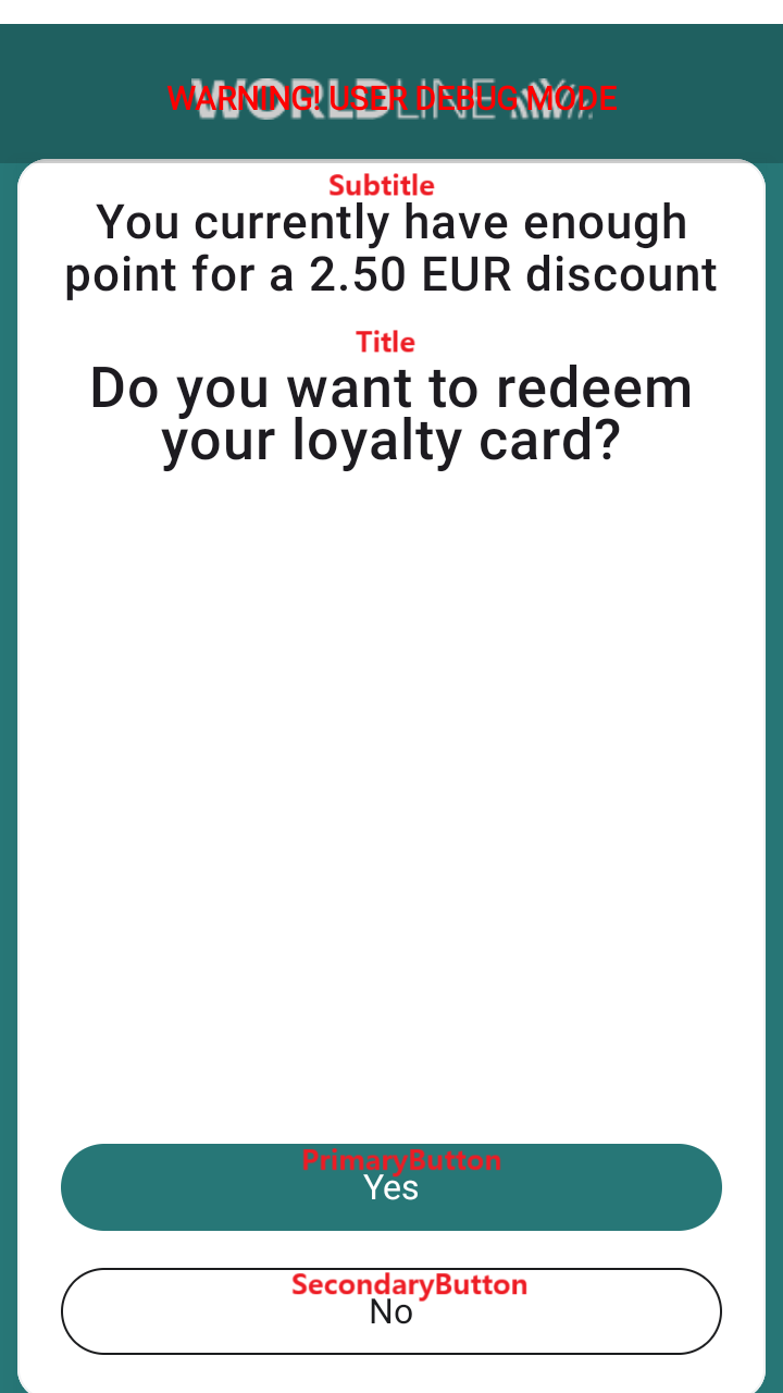
- Purpose: This screen displays general information or messages to the user, typically with a title and subtitle. It's used for simple notifications or confirmations.
- How to open: This screen appears when the external system sends a request with InfoScreen object in the MessageContent to display a simple informational message.
- Elements & interaction:
- Logo: (Optional) Worldline logo may be displayed at the top.
- Title: A main heading for the screen.
- Subtitle: Additional information or a sub-heading.
- Primary button (e.g., "Accept", "OK"): Tap this button to confirm you have viewed the information and proceed.
- Secondary button (e.g., "Cancel", "Back"): Tap this button to dismiss the screen or go back to a previous step.
2. Image info screen
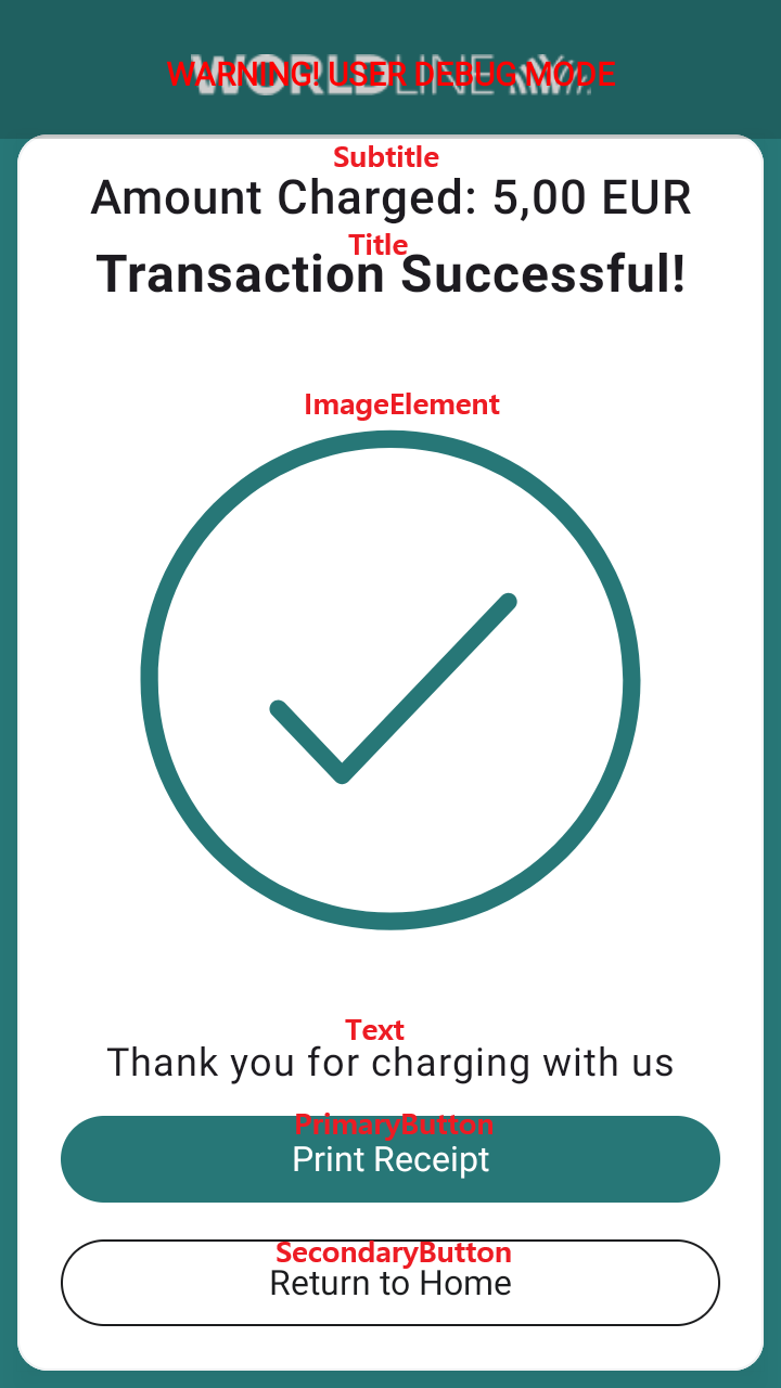
- Purpose: This screen displays an image along with a title, subtitle, and descriptive text. It's used to convey important information or instructions visually.
- How to open: This screen appears when the external system sends a request with ImageInfoScreen object in the MessageContent to display an image with accompanying information.
- Elements & interaction:
- Logo: (Optional) Worldline logo may be displayed at the top.
- Title: A main heading for the screen.
- Subtitle: Additional information or a sub-heading.
- Icon: A visual icon related to the message.
- Text: Detailed text explaining the image or providing instructions.
- Primary button (e.g., "Accept", "OK"): Tap this button to confirm you have viewed the information and proceed.
- Secondary button (e.g., "Cancel", "Back"): Tap this button to dismiss the screen or go back to a previous step.
3. Multi-options single selection screen
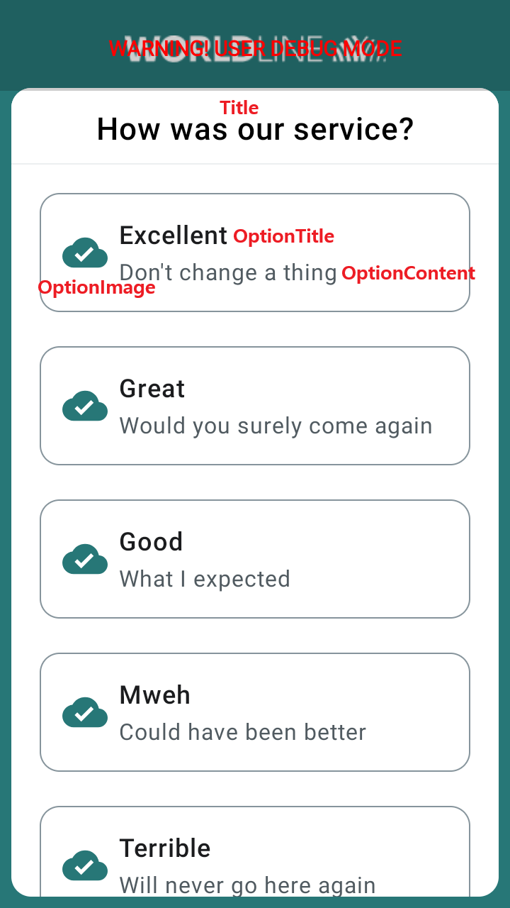
- Purpose: This screen presents a list of options from which you must select only one. It's used for choices where only one answer is valid.
- How to open: This screen appears when the external system sends a request with MultiOptionsSingleSelectionScreen object in the MessageContent and requires you to make a single choice from a predefined list.
- Elements & interaction:
- Logo: (Optional) Worldline logo may be displayed at the top.
- Title: A main heading for the screen, indicating the type of selection required.
- Option list: A list of selectable items. Each item may have an icon, title, and content.
- Selecting an option: Tap on the desired option from the list. The screen will typically close automatically after your selection is made.
4. QR screen
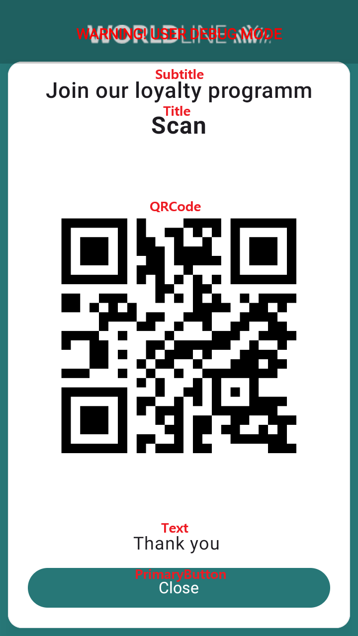
- Purpose: This screen displays a QR code, usually accompanied by a title, subtitle, and descriptive text. It's used for actions like scanning with another device or displaying payment information.
- How to open: This screen appears when the external system needs to present a QR code to the user. It sends a request with QRScreen object in the MessageContent.
- Elements & interaction:
- Logo: (Optional) Worldline logo may be displayed at the top.
- Title: A main heading for the screen.
- Subtitle: Additional information or a sub-heading.
- Text: Text providing context or instructions for the QR code.
- QR code: The scannable QR code image.
- Primary button (e.g., "Accept", "OK"): Tap this button to confirm or proceed after the QR code has been used.
- Secondary button (e.g., "Cancel", "Back"): Tap this button to dismiss the screen.
5. Info table screen
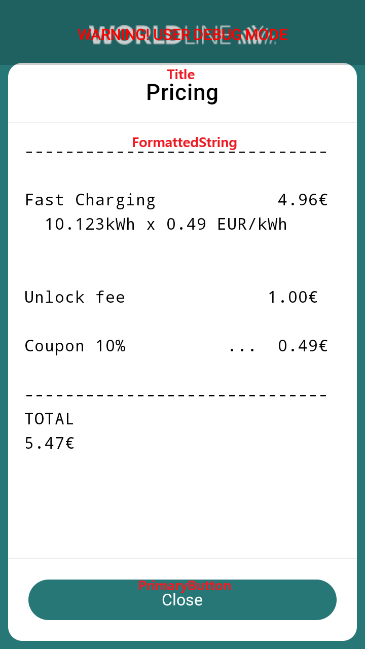
- Purpose: This screen displays formatted text, typically in a table-like structure, to present detailed information such as a receipt or transaction summary.
- How to open: This screen appears when the external system needs to display structured text information. It sends a request with InfoTableScreen object in the MessageContent.
- Elements & interaction:
- Logo: (Optional) Worldline logo may be displayed at the top.
- Title: A main heading for the screen.
- FormattedString: The formatted text, which might represent a receipt, a list of items, or other structured data.
- Primary button (e.g., "Accept", "OK"): Tap this button to confirm you have viewed the information and proceed.
- Secondary button (e.g., "Cancel", "Back"): Tap this button to dismiss the screen.
6. Signature screen
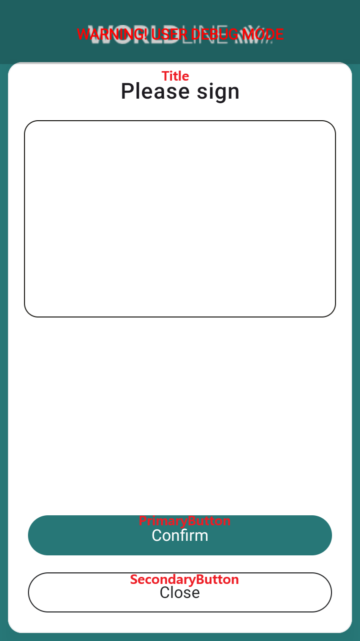
- Purpose: This screen allows the user to provide a digital signature, typically by drawing on the screen.
- How to open: This screen appears when the external system requires a signature for authorization or confirmation. It sends a request with SignatureScreen object in the MessageContent.
- Elements & interaction:
- Logo: (Optional) Worldline logo may be displayed at the top.
- Title: A main heading for the screen, indicating the purpose of the signature.
- Signature area: A blank area where you can draw your signature using your finger or a stylus.
- Primary button (e.g., "Accept", "Confirm"): Tap this button to accept and submit your drawn signature.
- Secondary button (e.g., "Clear", "Cancel"): Tap this button to clear the signature area or cancel the signature process.
7. Image screen
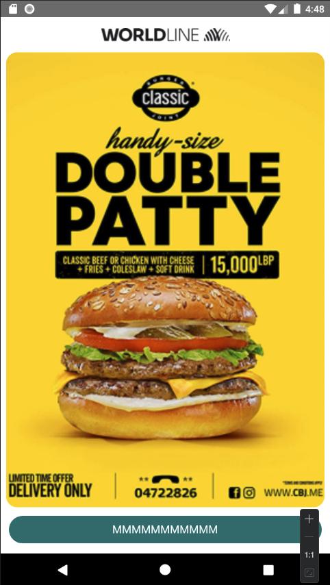
- Purpose: This screen displays a single image, often a large one, without additional text or complex interactions.
- How to open: This screen appears when the external system needs to display a standalone image as base64. It sends a request with ImageScreen object in the MessageContent.
- Elements & interaction:
- Logo: (Optional) Worldline logo may be displayed at the top.
- Image: The main image displayed on the screen.
- Primary button (e.g., "OK", "Continue"): Tap this button to acknowledge the image and proceed.
- Secondary button (e.g., "Cancel"): Tap this button to dismiss the screen.
8. Multi-options multiple selection screen
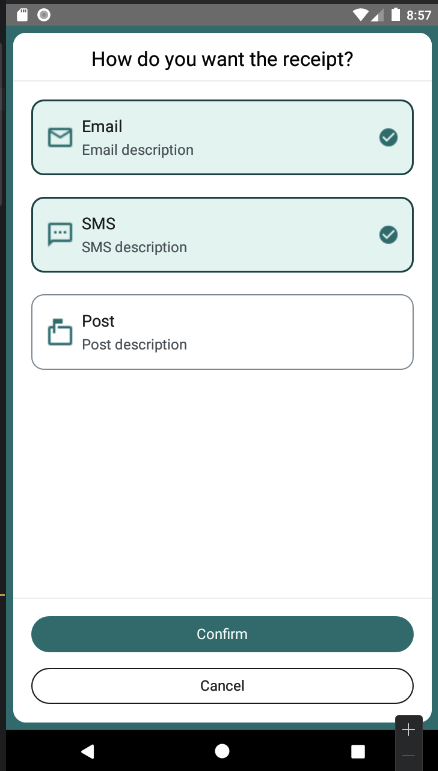
- Purpose: This screen presents a list of options from which you can select multiple items. It's used for choices where more than one answer is valid.
- How to open: This screen appears when the external system requires you to make multiple choices from a predefined list. It sends a request with MultiOptionsMultiSelectionScreen object in the MessageContent.
- Elements & interaction:
- Logo: (Optional) Worldline logo may be displayed at the top.
- Title: A main heading for the screen, indicating the type of selection required.
- Option list: A list of selectable items. Each item may have an icon, title, and content.
- Selecting options: Tap on each desired option to select or deselect it.
- Primary button (e.g., "Confirm", "Done"): Tap this button to submit your selected options.
- Secondary button (e.g., "Cancel", "Clear All"): Tap this button to dismiss the screen or clear all selections.
9. Capture data screen
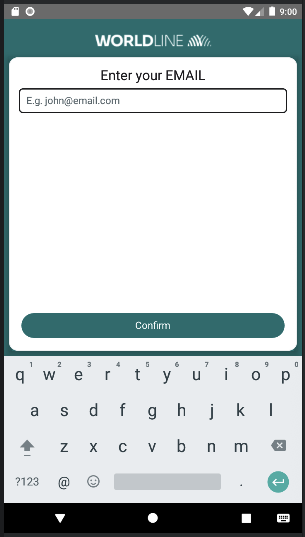
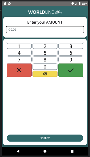
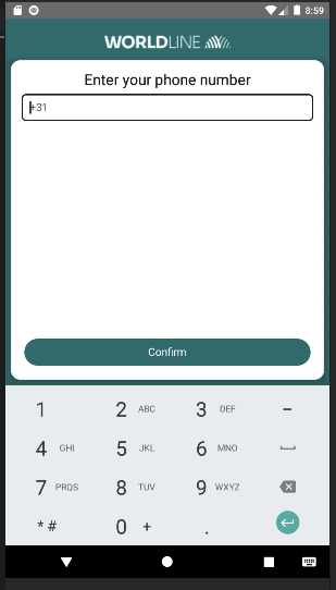
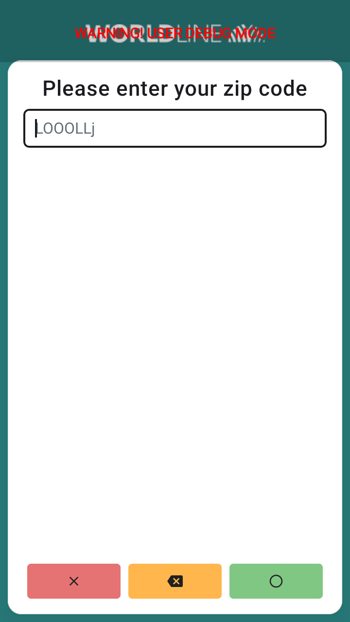
- Purpose: This screen is used to capture various types of data from the user, such as email addresses, phone numbers, amounts, or zip codes.
- How to open: This screen is shown when the external system requires specific data input from the user. The request contains a CaptureDataScreen object in the MessageContent, and the required input type is indicated by CapturingDataType, which can be EMAIL, AMOUNT, PHONE_NUMBER, or ZIP_CODE.
- Elements & interaction:
- Logo: (Optional) Worldline logo may be displayed at the top.
- Title: A main heading for the screen, indicating the type of data to be captured.
- Input field(s): One or more fields where you can enter the requested data (e.g., a text field for email, a numeric field for amount).
- Hint text: Placeholder text within the input field to guide you on what to enter.
- Primary button (e.g., "Submit", "Confirm"): Tap this button to submit the entered data.
- Secondary button (e.g., "Cancel", "Clear"): Tap this button to dismiss the screen or clear the input fields.
Available custom icons in our UI library
| Name | Icon |
|---|---|
| ic_cloud |  |
| ic_email |  |
| ic_markunread_mailbox |  |
| ic_smiley_satisfied |  |
| ic_smiley_medium |  |
| ic_smiley_dissatisfied |  |
| ic_connector_chademo |  |
| ic_connector_combo |  |
| ic_connector_css |  |
| ic_connector_shuko |  |
| ic_connector_swiss |  |
| ic_connector_uk |  |
| ic_connector_type_1 |  |
| ic_connector_type_2 |  |
| ic_connector_type_3 |  |
| ic_sms |  |
| ic_yes |  |
| ic_no |  |
| charging_cable_car |  |
| charging_cable_car_gif |  |